Voice Interface
Design for
Automobile
In-car voice assistants frustrate the people who rely on them: satisfaction averages just 2.2 out of 5. Working with GAC Motor, I studied 55 real-world cases, interviewed drivers and an in-house VUI designer, and built a design toolkit made for voice, not borrowed from screens. Then I used it to design a new in-car assistant, and tested it against what’s actually on the road. Usability score: 64% → 85%.
Sponsor & Challenge
A real automaker.
A problem no one had solved.
GAC Group (Guangzhou Automobile Group) is one of China’s largest automakers. Its ADiGO intelligent-connected ecosystem already ships on production electric vehicles, integrating autonomous driving, IoT, and infotainment. But GAC wasn’t asking me to polish what already shipped: they wanted new design directions for the next-generation ADiGO system, specifically the opportunities that different modalities, combined with voice, could unlock.
That gave this thesis something rare: a live industry partner, real product constraints, and a deliverable that had to hold up against a professional VUI team’s scrutiny, not just an academic rubric.

Context
Research before design.
Always.
Voice interaction in cars is new territory. When I started this project, there was no established design framework for it: only scattered industry implementations (Siri, Alexa Auto, Google Assistant) with generally low user satisfaction.
Instead of jumping to solutions, I spent the first half of the project deeply understanding the problem space: what’s out there, what fails, what drivers actually need, and what a real automaker wants from voice AI.
That research produced two things: a participatory design toolkit built specifically for voice, giving designers a structured way to make decisions about personality, conversation, and multimodal handoffs; and a redesigned in-car voice assistant, built with that toolkit and validated across two rounds of usability testing.
Both matter. The toolkit is the reusable contribution. The assistant is proof it actually produces something better — see the results below.
55
real-world VUI cases analyzed
4
research methods deployed
2.2/5
avg. satisfaction with current voice assistants
3
attention levels mapped in taxonomy
The Problem
Drivers are frustrated.
And they have a point.
A preliminary survey surfaced a consistent pattern: people use voice assistants in cars because they have to, due to hands-free laws and road safety requirements. But satisfaction averaged just 2.2 out of 5. Why?
01
It doesn’t understand you
Users frequently said their input “was hard to understand by the device,” especially with accents, background noise, or natural speech patterns.
02
Recovery is broken
When the system misunderstands you, recovering is difficult: users often have to start the entire conversation over. No graceful fallback, no partial recovery.
03
It creates new safety problems
Intended to reduce distraction, voice assistants often force users to look at the screen to verify commands. The solution became the problem.
04
Touch is still faster
For simple tasks, users said touch screens were faster than voice. The assistant wasn’t worth the cognitive overhead of activating it and rephrasing commands until they worked.
Voice assistants currently do not fully understand natural language, and do not fully utilize the advantages of voice interaction.Source: key finding from preliminary survey synthesis
Research
Four methods to understand
one deeply human problem.
Each method answered a different question. Together they built a complete picture of what voice interaction in cars actually needs to be.
01: Desktop Research & Taxonomy
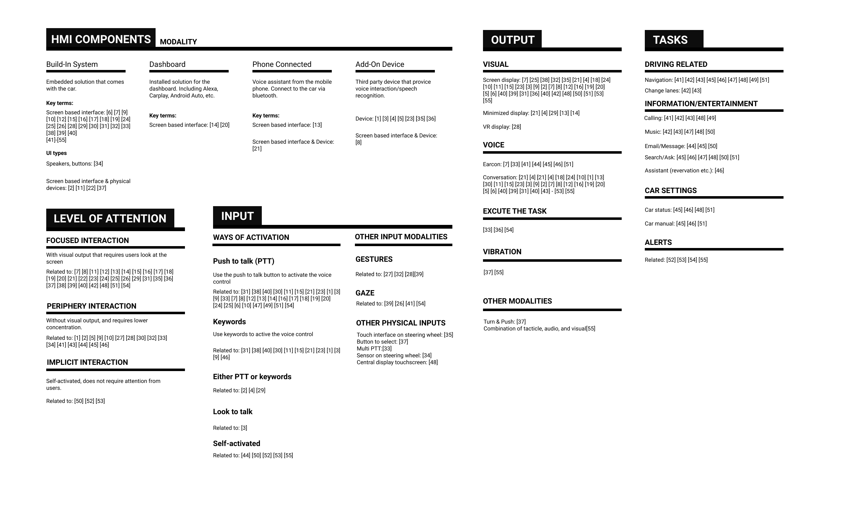
55 cases. Every input and output method mapped.
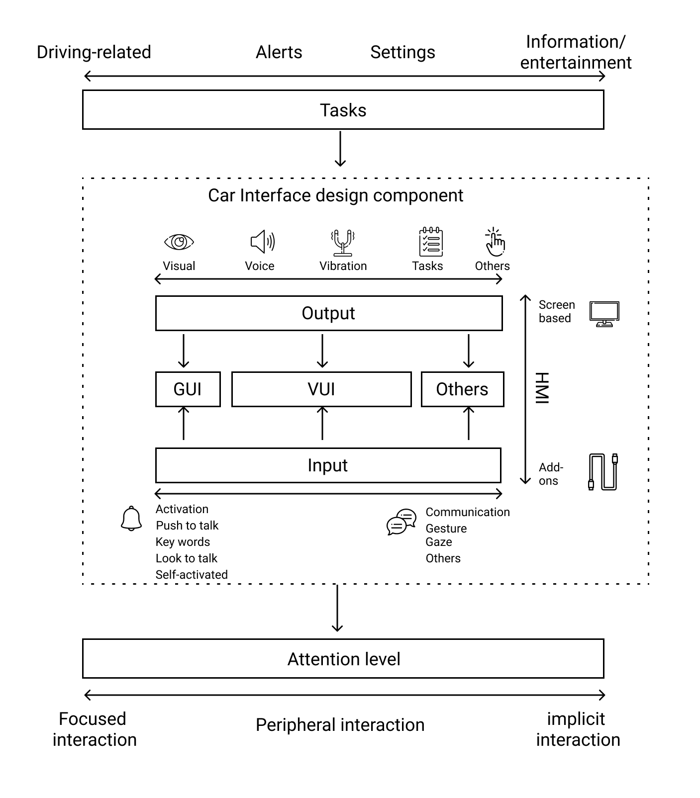
I started with a thorough literature review: how does voice interaction work across different in-car systems? What are the HMI components? How do attention requirements vary by task?
The review led to a taxonomy of 55 real case studies, categorizing them by HMI type, input method, output method, cognitive load level (focused / peripheral / implicit), and task type (driving, alerts, navigation, infotainment).
The most important insight: different voice interaction modes correspond to different levels of driver attention. This became the organizing principle for the entire project.

02: Preliminary Survey
Current voice assistants score 2.2 out of 5.
I surveyed current drivers about their experiences with in-car voice assistants: Siri, Alexa Auto, Google Assistant, and built-in systems. The results were clear and consistent.
- Generally low satisfaction: 2.2 out of 5 average
- User input is frequently misunderstood by the device
- Recovering from errors means starting the entire conversation over
- Safety concern: users still look at the screen to verify commands
- Touch is faster for simple tasks; voice felt like overhead
The data confirmed the opportunity: these systems do try to help with hands-free interaction, but they fail in the specifics: understanding natural language, recovering from errors, and knowing when not to require active attention.
03: In-Depth Stakeholder Interview
Three things a manufacturer expects from voice AI.
I interviewed a voice interaction designer at an automotive manufacturer to understand what “success” looks like from the industry side, not just from users. Their expectations shaped what the design toolkits needed to address.
Understand vague instructions
The assistant should parse natural, incomplete language, filling in the gaps from context the way a human would. Not require rigid command syntax.
Be one step ahead
Anticipate what the user will need next based on context (current location, time, calendar, previous behavior) rather than waiting to be asked.
Feel like a human being
Natural dialogue rhythm, personality, the ability to handle ambiguity gracefully. Not robotic command-response patterns.
The problem statement, refined
Voice assistants currently do not fully understand natural language, and do not fully utilize the advantages of voice interaction.
Voice assistants currently do not fully understand vague instructions, have seams in multimodal synthesis, and do not fully utilize the advantages of voice interaction.
That shift locked every design decision that followed onto two concrete targets: understand vague instructions, and stitch together the seams in multimodal experience. Both became load-bearing goals for the toolkit below.
04: Contextual Inquiry
Three drivers. Observed in real conditions.
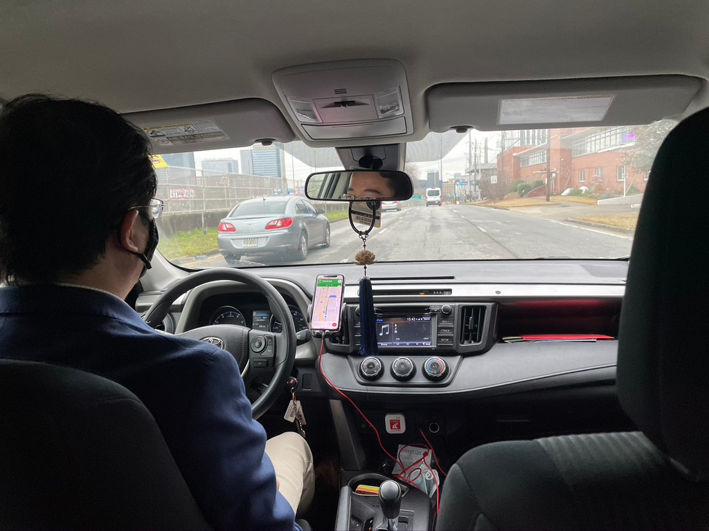
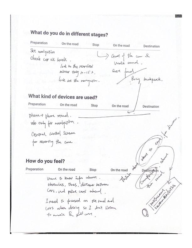
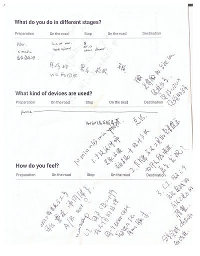
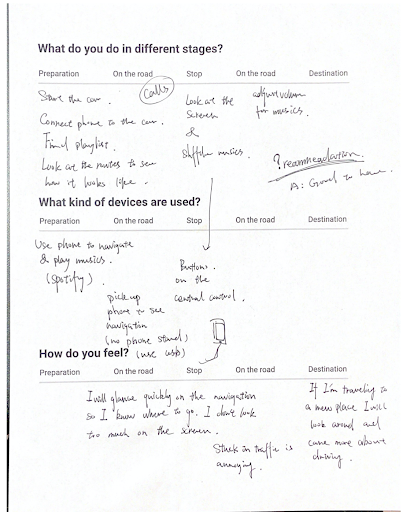
I conducted contextual inquiries with three drivers in realistic driving environments, sitting in the back seat, observing behavior and asking questions during the drive. This method was chosen because voice interaction behavior changes significantly in context: people use different vocabulary, shorten commands, and respond differently to failures when they’re also managing the road.
The contextual inquiry grounded the taxonomy in real behavior, and revealed patterns the survey couldn’t: which failure modes caused genuine frustration vs. mild annoyance, which tasks drivers tried voice for even when they expected failure, and how they developed workarounds.
The Toolkit
A toolkit built for voice,
not borrowed from screens.
Every existing tool for designing voice interfaces was adapted from GUI methods: card sorting, wireframes, flow diagrams. None of them captured what actually makes voice hard: personality, conversational tone, and the seams between modalities. So I designed a three-part participatory toolkit that targets exactly those, then used it myself to design the assistant in the next section.
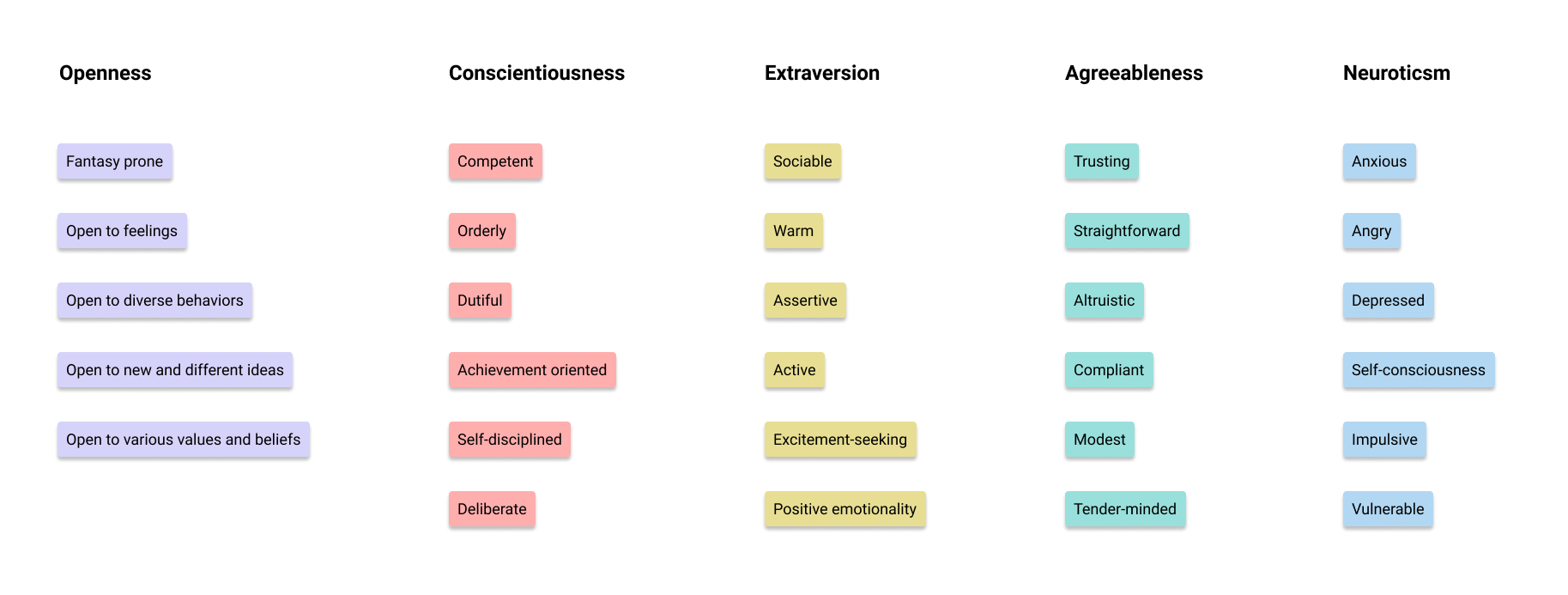
Personality Framework
Derived from the Big Five personality model (OCEAN), this toolkit gives designers a vocabulary and decision structure for defining the voice assistant’s personality, because the research showed this was a major differentiator in user trust and satisfaction.
Instead of making personality decisions intuitively or inconsistently, designers can use the framework to deliberately choose traits and trace them through the interaction design: how the assistant handles ambiguity, failure, and proactive suggestions.
Conversation Design Cards
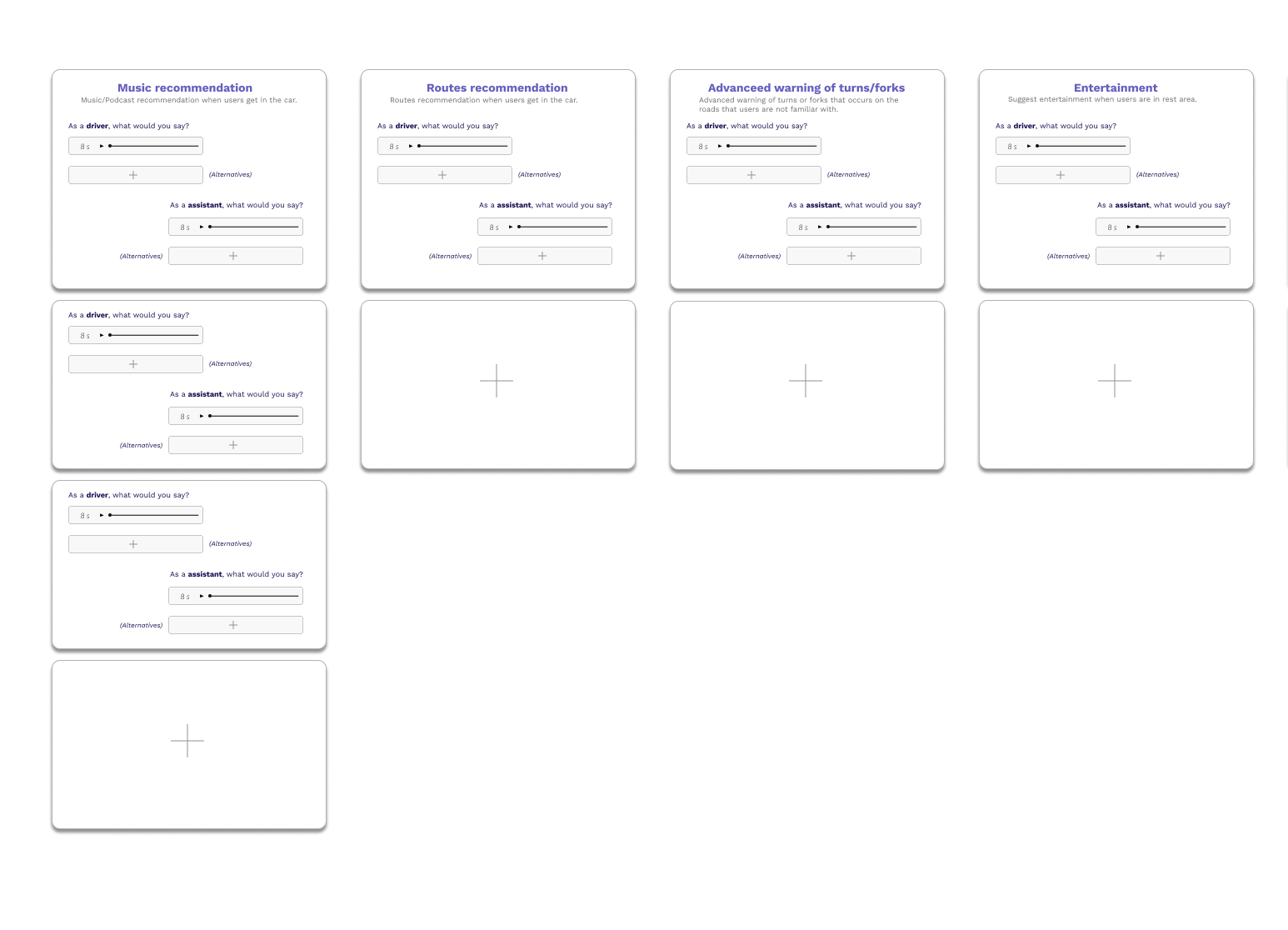
The second toolkit is a set of use case scenario cards covering the key interaction contexts in a car: music recommendation, route recommendation, advanced fork/turn warnings, entertainment, and more.
Each card defines: what the driver might say, what the assistant should say, and the alternative/fallback interaction. This gives designers a systematic starting point for conversation design rather than making each scenario from scratch.
Seamless Multimodal Experience (SME) Map
The third piece is a car-interior diagram that participants annotate directly: for each interaction, where should voice be reinforced by another modality? A screen glance (C1), a haptic cue (C2), or both, and exactly where in the cabin?
This turned “seamless multimodal experience” from an abstract design goal into something a designer could actually mark up, defend, and hand off. It’s the toolkit piece that most directly answers the “seams in multimodal synthesis” half of the refined problem statement.

Even the toolkit got tested
4 participants, one hour, and the toolkit’s own flaws surfaced immediately.
Before using the toolkit for real design work, I ran it through a participatory design workshop first, treating the methodology itself as the thing under test.
What worked
- Role-play collected conversation corpus close to real, natural speech patterns
- The multimodal (SME) design step surfaced surprising, genuinely useful ideas
- Abstract concepts (personality, multimodal handoff) became hands-on, concrete tasks
What broke & how I fixed it
- Too many personality types chosen → scattered dialogue data. Fixed: converge on the 3 traits all participants agree on before conversation design
- Role-play prep time was too short. Fixed: added a dedicated 3–5 minute scripting window before each round
The Design
Using the toolkit to design
an assistant you could actually use.
The toolkit isn’t the finish line. I used it — the personality framework, the conversation cards, the SME map — to design and build a working voice assistant prototype in Voiceflow, aimed directly at the two failures the research kept surfacing: an assistant that can’t handle vague language, and one that treats every driver identically.
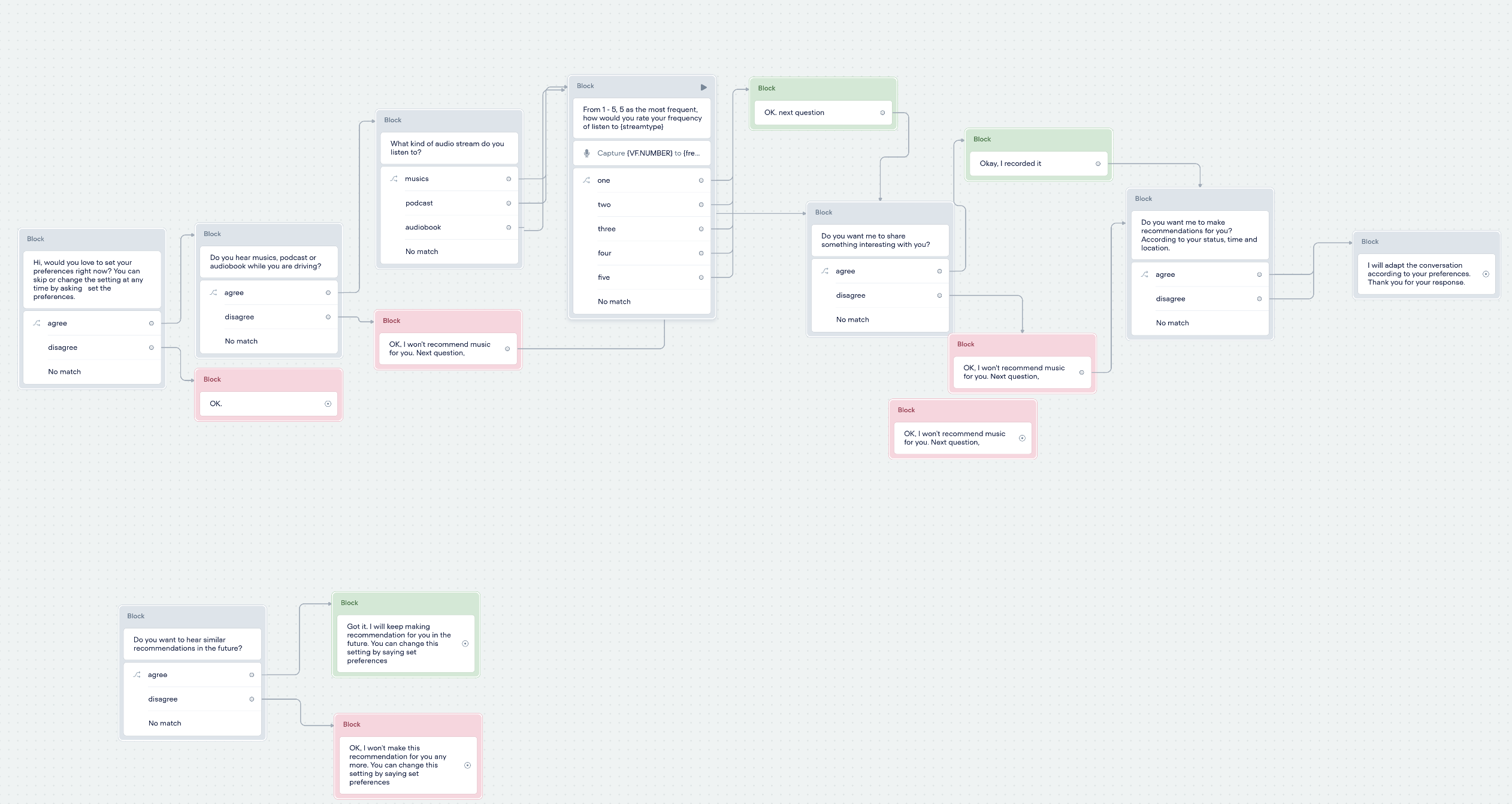
Asks your preferences, once
Fixes what round-one testing exposed: some drivers never listen to music, yet got music recommendations anyway. Onboarding captures preferences (chats, music, car status) on first use, and every conversation after ends with “want more like this?” so the assistant learns instead of guessing.
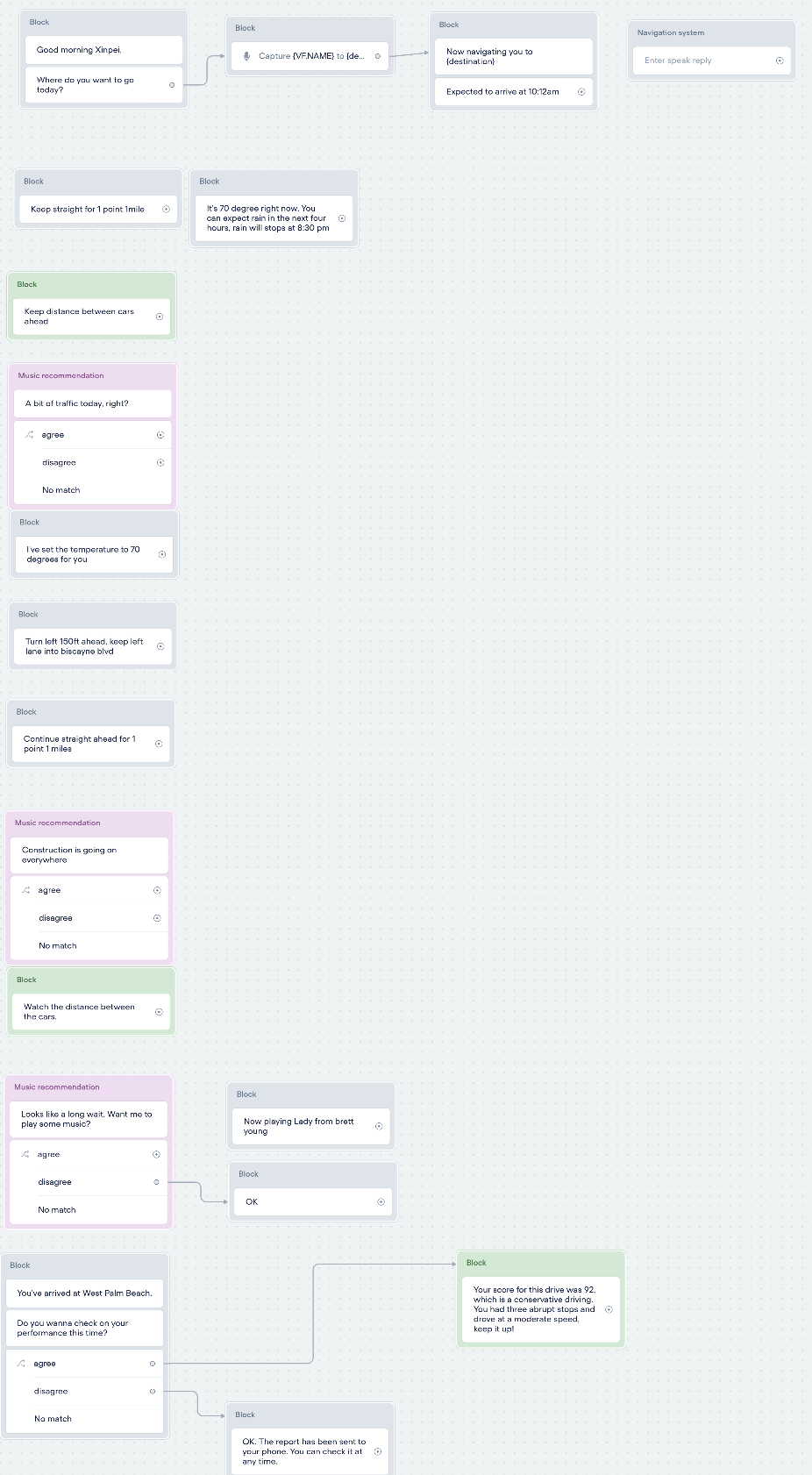
Reminds you before you have to ask
Combines the navigation destination with live fuel level to proactively ask “you’re under a third of a tank, refuel on the way?” instead of waiting for a low-fuel light. Also covers road conditions, car status checks, and a driving score.
Watch the driving-mode demo ↗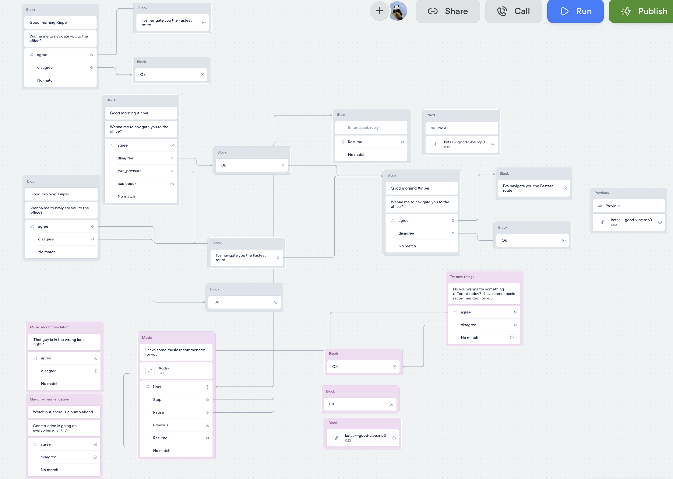
Reads your state, not just your words
Uses a fatigue-detection camera to read driver state and proactively offers entertainment; also handles resuming audiobooks, music/podcast recommendations, casual chat, and calls — the part users later described as feeling “human” and a genuine outlet for road-rage venting.
Watch the infotainment-mode demo ↗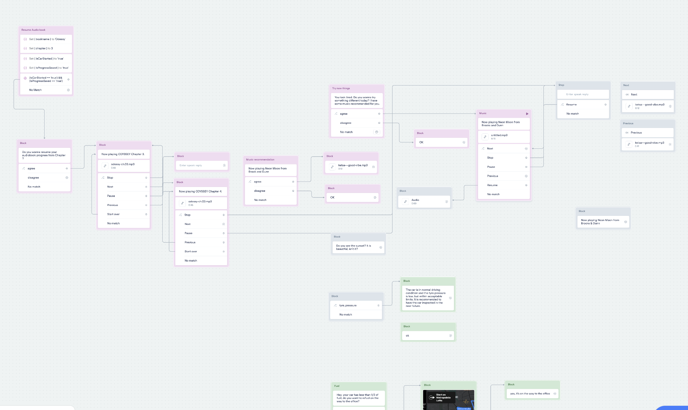
Answers the manufacturer’s own ask, directly
The GAC designer named this directly: “how to control hardware, like the high beam” was an unsolved design problem. This module brings vehicle hardware, windows, AC, high/low beam, into voice command reach — and round-two users kept asking for more of exactly this.
Validation
Not just “users said they liked it.”
Usability scores actually moved.
Two rounds of usability testing, from concept validation to a head-to-head scored comparison, pushed this from “users seemed to like it” to a number that holds up.
Round 1 · Concept validation
Wizard of Oz testing, 3 remote participants
The early prototype was limited by remote-testing conditions and speech-recognition accuracy, so I ran it Wizard of Oz style: participants believed they were talking to a working voice assistant, while I operated the prototype’s responses behind the scenes. That let me validate the conversation design and overall concept before recognition accuracy could get in the way.
“I wish I had this in my car.”
Feedback also surfaced a clear gap: some users never listen to music while driving and found the recommendations redundant, others wanted to be asked their genre first. That feedback directly produced the onboarding module above.
Round 2 · Head-to-head scoring
5 participants, System Usability Scale (SUS) before & after
Round 2 moved in person, so participants interacted with the voice model for real: one screen played a first-person driving video while I ran the voice prototype live from a second laptop behind them. Each participant scored their own current in-car voice assistant on the System Usability Scale first, then scored the new prototype after using it — a direct, same-person comparison of old vs. new.
Current in-car voice assistant
avg. 64%
The new design
avg. 85%
| Participant | Current assistant | New design |
|---|---|---|
| P1 | 60% | 87.5% |
| P2 | 62.5% | 85% |
| P3 | 65% | 87.5% |
| P4 | 62.5% | 85% |
| P5 | 70% | 80% |
Five participants, five improvements. Average SUS score moved from 64% to 85%, a 21-point jump, and it’s a direct same-person comparison under the same scoring standard, not a rough comparison across two different samples.
Positive feedback
- Users liked being asked for preferences at the end of the conversation
- “The new voice assistant is much smarter”
- Most conversations happened while waiting at a light, which users found non-distracting
- “Helpful and fun,” “just right”
What users still asked for
- The onboarding walkthrough felt a bit long
- Some answers fell outside the prototype’s scripted utterances and weren’t recognized
- More use cases wanted: window control, air conditioning
Reflection
Not just “the research was rigorous.”
The design measurably got better.
64% → 85%
avg. SUS usability score, before & after
3
toolkit components: personality, conversation, SME map
4
functional modules in the final prototype
2
rounds of usability testing, 8 participants total
The toolkit and the artifact both had to hold up
Toolkits, frameworks, and decision structures are design outputs too, they just serve a different user: other designers. But a toolkit only proves itself if you can use it to design something measurably better. The SUS score jump is the evidence the methodology actually works, not just that it sounds reasonable.
Context changes everything in in-car UX
Survey data told one story. The contextual inquiry told another. Drivers rationalize their behavior after the fact, but in the moment, frustration is immediate and recovery strategies are improvised. You have to be in the car to see it.
The attention model opened more questions than it closed
The focused / peripheral / implicit attention framework is a useful starting point, but applying it rigorously would require longitudinal studies with more participants across more driving conditions. This project sketched the map; filling it in is future work.