Medical DeviceAI DiagnosticsMilitary & EMS0→1 Handheld
Taking an FDA‑cleared
AI device from hospital cart to battlefield
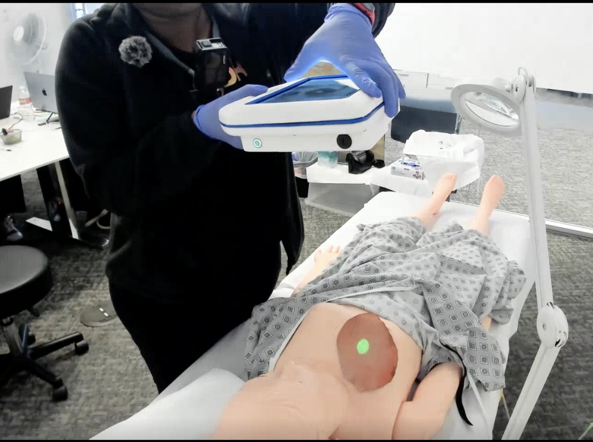
Shipped to military and EMS partners in June 2026, validated in summative human factors testing, and supporting a 510(k) submission: Spectral MD’s FDA-cleared AI burn assessment, rebuilt as a 4-lb handheld for the point of injury without touching the cleared imaging core.
Role
Sole UX Designer
Duration
2 years
Team
BME, software, optics, RA, PM
Scope
Hardware + Software
Status
Shipped June 2026
Who did what
Independently
Owned end to end
Every UX/UI decision and deliverable, from early flows to final screens
Workflow and requirements, defined with BME, engineering, RA, and PM
Design specification and handoff to the software team
Led
Set direction, then tested it
Used two formative rounds to test the riskiest decisions before they were locked
Decided the design response to every finding
Led the finished-device demo for military stakeholders
Deeply involved in
Contributed alongside specialists
Root-cause analysis of summative use errors (protocol and report by an external human factors consultant)
Software QA and V&V testing, with BME
From requirements to a validated, delivered product, as the only designer in the room.
The Problem
Cart to handheld is not a smaller screen
The cart’s AI flags burn areas unlikely to heal without grafting, and stitches multiple scans into one TBSA% (Total Body Surface Area burned) figure. My brief: re-platform it into an iPad-sized handheld, and make one build serve two customers: a field-deployment program at ROC1–2, forward of any hospital, and the company’s expansion from burn centers and ERs into EMS.
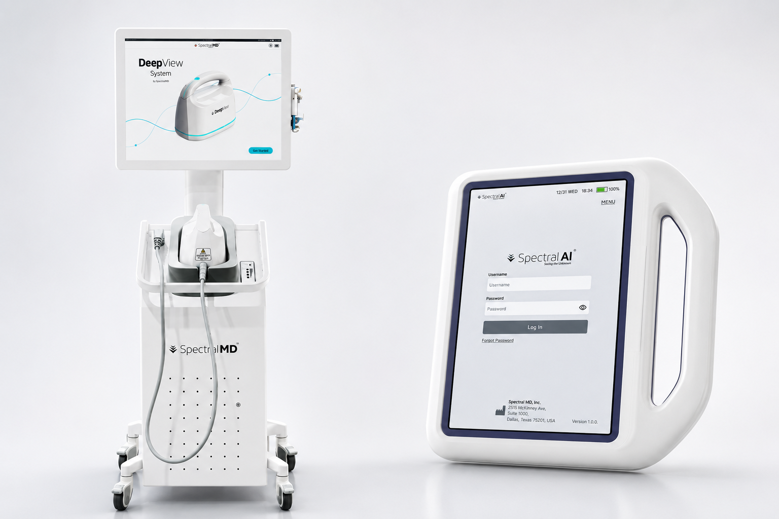
Add: triage-hero.jpgCart (left) vs. handheld (right)
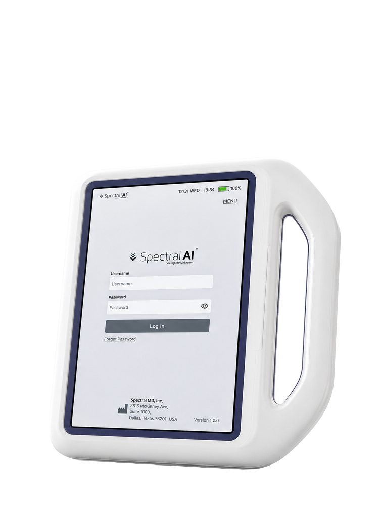
The DeepView cart and the new handheld: same predicate imaging core, four pounds instead of a few hundred.
Cart · Burn Center
Handheld · ROC1–2 / EMS
Environment
Indoors, controlled lighting, mains power
Tent, field, or ambulance; light and power both unpredictable
User
Burn-specialty nurse, deep experience with the injury
Medic or EMS responder, may see a severe burn only rarely
Time pressure
Routine clinical workflow
Triage decision under resource constraints, made in seconds
Training budget
Ample, ongoing clinical training
Minutes, and the skill decays fast between uses
Decision needed
Non-healing area, to guide a surgical decision
TBSA%, to set evacuation priority
The last row mattered most. At the point of injury, nobody is deciding whether to graft. They’re deciding who gets evacuated first, and how fast. That’s Decision 01.
Constraints
Three things I couldn’t change
Every decision below runs into at least one of these, tagged C1 to C3. On a regulated product, the scarce skill isn’t proposing the ideal design. It’s finding the best available one after the ideal gets rejected.
C1
Frozen core
0
changes allowed to the imaging principle, five-camera array, or prediction algorithm
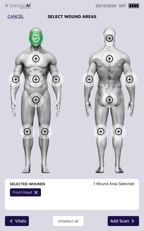
The handheld goes through FDA 510(k) with the cleared cart as its predicate device. That path only holds if the two are substantially equivalent, so everything the device does, down to its body-map region system, was fixed on day one. I could only redesign how a user gets there, which made this an interaction-design project end to end.
C2
Hardware
~4lbs
five cameras, a battery, and thermal management in one handheld
Light for a cart, heavy for one gloved hand. The camera array images at a fixed distance, so the field of view is fixed too, and the sensor stack and GPU leave little headroom for live image analysis or heavier models.
C3
Use context
ROC1–2
point-of-injury care, in a tent, a field, or an ambulance
Unpredictable light and power, gloved hands, and users who may see a severe burn only rarely. Training is measured in minutes and fades between uses, the triage call is made in seconds, and one build has to serve both military and EMS.
Timeline
Two years, four decisions
Where each decision landed, from requirements to delivery. Each marker links to its decision.
Define
Requirements, workflows, and the URRA, with BME, engineering, RA, and PM
Military and EMS partners; finished-device demo for military stakeholders
Decision 01
Lead with TBSA%, and give each mission its own hierarchy
What I decided
Make TBSA% the handheld’s headline number instead of the cart’s non-healing area, and give each build its own patient-list order on the same frozen core: by TBSA% for military evacuation triage, by last scan date for ongoing commercial care.
Why
The cart answered a burn surgeon’s question: which areas won’t heal without grafting. At ROC1–2 nobody is deciding whether to graft. A medic is deciding who gets evacuated, and how fast, and TBSA% is the number that drives that call. Leading with non-healing area would have put the right answer to the wrong question on the first screen.
Changing what the AI produces was off the table (C1): both builds run the same cleared core and show the same outputs, so the lever was hierarchy, not capability. The alternatives each fell short. Keeping non-healing area as the headline, with TBSA alongside it, puts two co-equal numbers in front of a medic with minutes of training (C3) and asks them to pick. A single patient list for both customers forces one order on two different jobs: severity-first triage and recency-first caseload management. So neither build removes anything; each reorders it for its mission.
Evidence
The clinicians in our summative study estimate TBSA at least four different ways today: the rule of nines, the Lund–Browder chart, the palm method, and in one case an iPhone photo. That inconsistency is the gap a TBSA-first device closes. 7 of 15 participants volunteered that the device would improve efficiency and consistency, especially at institutions without dedicated TBSA experience.
Result
One build opened two markets: military field care and EMS. The same rule carried to every screen: the fewest possible options per screen, with complex tasks (TBSA tracing, photo brightness and rotation) split onto dedicated screens so a user under pressure can finish by hitting “next”. When formative participants called a report-version picker actively unpleasant in an emergency, the picker went: results now open on the latest report, with history one scroll away.
Military build
Sorted by TBSA%, for evacuation triage
The patient list sorts by TBSA%, surfacing the most severely burned patients first when resources and transport are constrained.
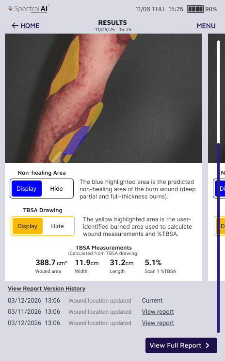
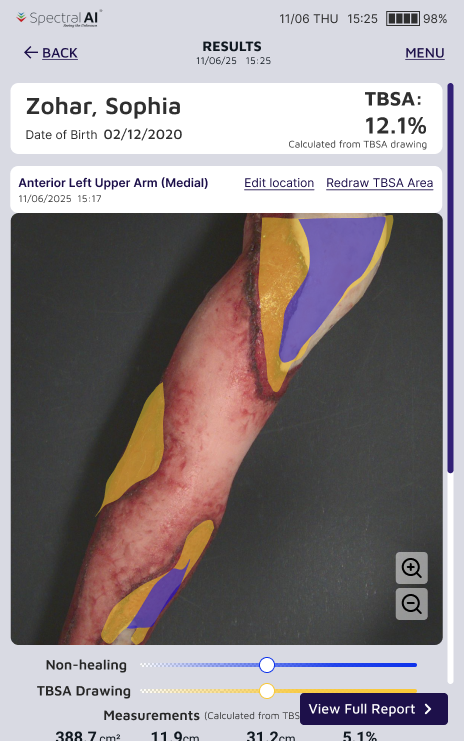
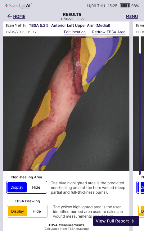
TBSA sits front and center on the results screen: it’s the number that drives the “evacuate or not, and how fast” decision at ROC1–2.
Dog-tag scanning auto-fills patient identity, a feature with no equivalent need in the commercial build.
Commercial build
Sorted by last scan date, for ongoing care
The patient list sorts by last scan date, so a physician managing an active caseload finds recently seen patients quickly.
Non-healing area, the metric that drives a surgical decision, is retained but demoted; it belongs to the ROC3–4 hospital stage of care, not the point of injury.
Same rule, results screen
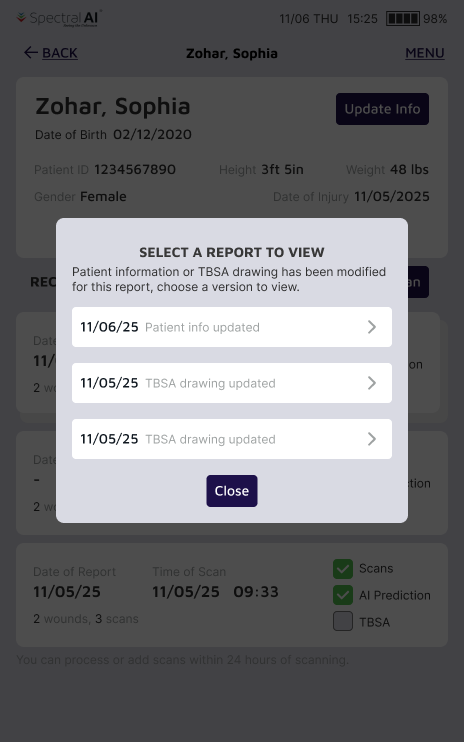
Before
Add: triage-history-before.jpg
A choice, before you even see a result
After
Add: triage-history-after.jpg
Straight to the latest report; history is one scroll away
Decision 02
Move quality control before the shutter, even when the ideal version isn’t buildable
What I decided
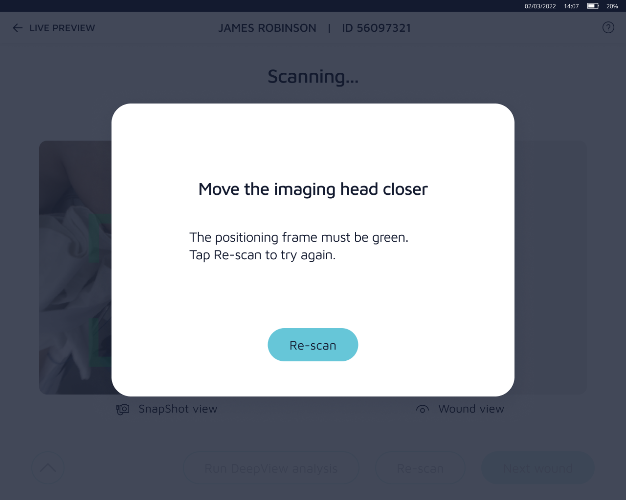
Move capture feedback from after the photo to before it. When the ideal version, live image-quality analysis, proved infeasible on this hardware, ship the feasible approximation and say plainly that it is one.
Why
The AI is only as good as the photo it receives. The cart’s flow is reactive: shoot, then learn the photo was too close, too far, or failed processing. In a controlled room a retake costs seconds. At the point of injury, every failed capture is time not spent on the patient, or on cover.
The ideal was for the device to judge its own image quality live, catching exposure, motion blur, and underexposure before the shot. After repeated rounds with the optics team, that wasn’t feasible: the sensor stack can’t analyze a live frame that closely before capture (C2). Instead of dropping the idea, I broke it into the signals the hardware could produce in real time:
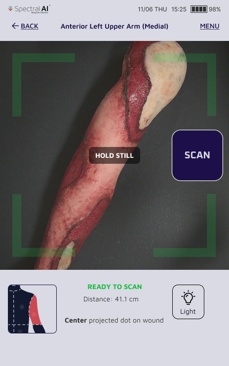
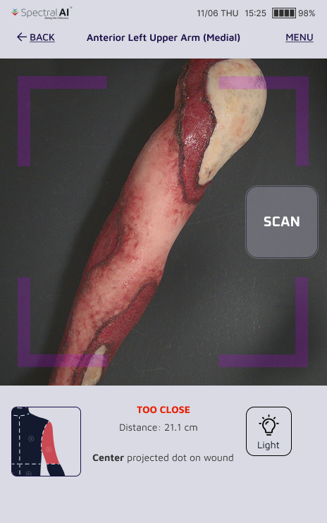
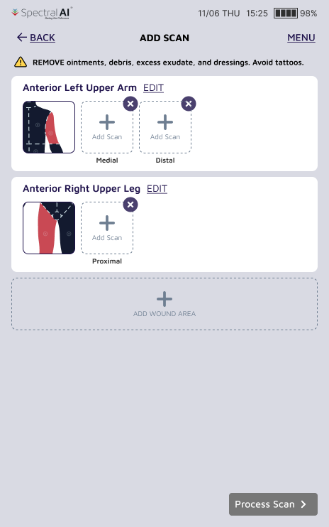
Live distance guidance: target versus current imaging distance, so the medic moves before shooting.
Motion detection: the IMU (inertial motion sensor) raises a “hold still” prompt the moment hand shake would blur the shot.
Light, handled at capture: a one-tap LED fill light for dark tents and ambulances (C3), plus automatic white-balance and exposure correction.
It isn’t the device reading its own image, but together the three cover most of what that would have caught.
Evidence
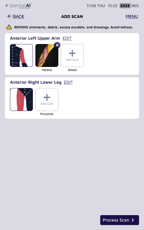
Formative testing showed the same after-the-fact pattern one step earlier in the flow. Because the field of view is fixed (C2), participants often found out only after capturing that they’d missed a wound on the far side of a limb, or selected one that needed removing, and the only fix was going back to the body map and starting over.
Result
Shipped: real-time distance, motion, and lighting guidance during capture. The same principle then extended to the wound list: add and delete controls now sit on the pre-capture overview, so a missed or extra wound is fixed in place without a restart. The user’s judgment was never the problem. The workflow assumed a foresight the fixed field of view doesn’t allow.
Before
Add: triage-capture-before.jpg
Cart: capture first, find out it failed after
After
Add: triage-capture-after.jpg
Motion detected: on-screen prompt to hold still before the shot blurs
After
Add: triage-capture-after-close.jpg
Too close: the frame turns magenta and prompts the medic to step back
Same principle, wound list
Before
Add: triage-woundlist-before.jpg
Missed a wound? Back to the body map
After
Add: triage-woundlist-after.jpg
Add or remove a wound in place, no restart required
Decision 03
When the body map redesign was rejected, fix the top error without touching the data
What I decided
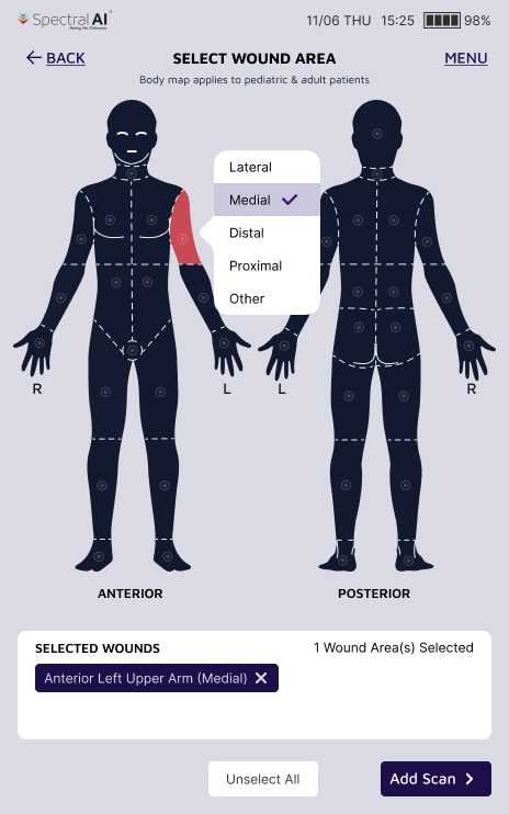
Keep the cart’s body-map regions exactly as cleared, and fix its most frequent error in the interaction instead: suffix selection moves from a separate, skippable step to an in-place choice beside the highlighted region.
Why
The most frequent error we’d observed on the cart was clinicians forgetting to select a suffix at all. For a medic with minutes of training (C3), a finely subdivided Lund–Browder-style map followed by a separate suffix step is a lot of load at exactly the moment attention is scarcest.
My first proposal went further: collapse the map into broad rule-of-nines regions and remove the suffix step entirely, for real cognitive-load savings. Regulatory Affairs rejected it. Simplifying the body map risked the substantial-equivalence argument the 510(k) depends on, and the region system was frozen with the rest of the predicate (C1). That left one lever: change how users reach the data, not the data itself.
Evidence
In summative validation, participants completed every critical task without a use error. They also flagged that the suffix terminology doesn’t match how they chart clinically, confirming what the rejected proposal was reaching for.
Result
Shipped, after a rejection. In-place suffix selection addressed the cart’s highest-frequency error without touching the predicate. The terminology gap is now on the roadmap for the next hardware generation, a quiet vindication of the original simplification.
Rejected
Add: triage-bodymap-simplified.jpgBroad regions, no suffix step, tap-and-go
My proposal: broad regions, no suffix, tap-and-go. Rejected for equivalence risk.
Shipped
Add: triage-bodymap-suffix.jpgSuffix options appearing in place, next to the selected region
Same region system as the cart, with suffix selection in place
Decision 04
The AI’s output can’t look like something you can change
What I decided
Replace the two continuous overlay-transparency sliders with two plain on/off toggles.
Why
The sliders were meant to fade the AI’s non-healing and TBSA markup so a clinician could see the photo underneath. In formative testing, participants read the color intensity as meaningful, as confidence or healing probability, and some believed dragging the slider changed the algorithm’s output. A user who thinks they’ve “adjusted” the result may act on an assessment the AI never produced.
Relabeling the sliders or captioning them “display only” wouldn’t have been enough. Either way, a draggable control would still sit on top of an AI result, and the misreading came from the control itself, not its label.
The toggle gives up something real. With a slider, a clinician could fade the markup halfway and see the AI’s boundary and the wound bed at once; with a toggle, they flip between the two. I judged the cost worth it because the core need survives: switching the overlay off still shows the full, unmarked photo. What’s lost is a side-by-side convenience. What’s removed is a way to misread a cleared AI output (C1). A lost convenience carries no clinical hazard; a misread assessment can. A visualization that can be mistaken for a control is a safety risk, not a UX preference.
Evidence
By summative validation, participants completed all 22 critical tasks without a single use error.
Result
Shipped as display, not control. It became a rule for every AI output on the product: the visualization has to be legible and impossible to misread as a control.
Before
Add: triage-overlay-before.jpg
Continuous sliders, read as AI controls
After
Add: triage-overlay-after.jpg
Plain on/off toggles: display, not control
Also shipped, in brief
Height and weight entry moved from a scroll wheel to a numeric keypad, a clear and consistent preference in testing.
The PDF report went from 4 pages to 2 and gained a TBSA image, so a physician sees patient info, TBSA, and the photo in one glance.
Alert copy went through repeated rounds of plain-language editing until it read at a glance under stress.
Outcome
One build, delivered to two markets
The handheld shipped in June 2026 and took the company into two markets the cart could never reach: military field care and EMS.
Delivered
June 2026, to military and EMS partners
Validated
Summative human factors validation passed
Regulatory
Supports a 510(k) submission, predicated on the cleared cart
Market
One build, two new markets: military field care and EMS
I led the finished-device demo for military stakeholders.
The usability evidence behind it
From the summative human factors validation: 15 practicing burn-care RNs, in a simulated bedside environment.
22/22
critical tasks completed without a use error
0
use errors across all critical tasks
15
Burn-care RNs completed the full task set across 9 clinical scenarios, after 30–45 minutes of training and a 1-hour decay period
0
Device drops, across every session
14/15
Participants rated the device user-friendly
7/15
Volunteered that it would improve efficiency and consistency in burn care, especially for institutions without dedicated TBSA experience
Within a couple of scans I stopped thinking about the device and just thought about the patient. That’s exactly what you want when you’re triaging.
Participant feedback, summative human factors validation
Reflection
What I’d do differently
Passing summative wasn’t the end of the list. Three things I’d do differently, and one call I’d make again.
01
Test the workflow order, not just the screens
Clinicians described a label-first habit: with an x-ray or a phone camera, they mark the wound location before capturing it. The handheld inherited that order from the cart. But its field of view is fixed, and most first-time users can’t judge how much a single shot covers, so a region labeled up front may not match what the camera can frame. Capture first, label from the photo, may genuinely fit this hardware better. I’d put both orders in front of users in the first formative round instead of leaving it as a next-generation question.
02
Test the weight under real conditions, not just the UI
Four pounds is light for a cart and heavy for one gloved hand. Under real conditions (gloves, a hot ward, an extended exam) it produces grip fatigue and real drop risk, and touchscreen response under gloves or long nails needs its own pass. I’d bring gloved, extended-hold sessions into formative testing so ergonomics shapes the design rather than the roadmap.
03
Bring charting evidence to the RA conversation
The summative study confirmed that the body-map suffix language doesn’t match how clinicians chart, the gap my rejected rule-of-nines proposal was trying to close. That evidence arrived after the decision. Next time I’d pair the proposal with clinician charting evidence from the start; it might have made the case for a regulatory pathway that doesn’t risk equivalence.
Deferred, on purpose
The call I’d make again: not shipping auto-trace
An in-development algorithm could auto-trace TBSA regions, removing one of the most error-prone, attention-heavy steps in the workflow. GPU headroom on the handheld (C2) and the algorithm’s own validation timeline didn’t line up with the delivery date. Shipping it would have meant underpowered auto-trace or a schedule slip neither funder could absorb.
I recommended holding it for a future release. Design decisions on a product like this sit where design value, engineering readiness, regulatory risk, and a fixed delivery date meet, and part of the job is recognizing when the right call is not yet.
Designing inside a regulated, life-critical product taught me to build an evidence chain for every decision, not just a rationale, and to speak RA, BME, and optics engineering well enough to keep pushing for the better version after a first proposal is turned down, while telling apart a fight worth having from a timeline worth protecting.
MethodologyURRA, IEC 62366, participants, training and decay
Risk basis
Our URRA (Use-Related Risk Analysis) defined the critical tasks; the summative task set was built from it.
Standards
IEC 62366 and FDA Human Factors guidance.
Formative
Two rounds. I defined what each round needed to answer, moderated and observed every session, and turned findings directly into the next iteration.
Summative participants
15 practicing burn-care registered nurses.
Training & decay
30–45 minutes of training, then a 1-hour decay period before testing.
Tasks & setting
Every critical task, completed independently across 9 clinical scenarios in a simulated bedside environment.
Authorship
Summative protocol and report by an external human factors consultant; I contributed to root-cause analysis of use errors.