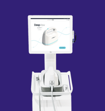
DeepView AI® predicts wound healing outcomes — but complex
workflows and uninterpretable results were blocking adoption.
I led end-to-end UX redesign to make life-critical AI fast,
clear, and trusted in clinical environments.
Complex multi-step workflows caused delays in time-critical ER and burn center scenarios.
AI-generated predictions were difficult to interpret — physicians couldn't trust results they didn't understand.
No shared design system across 4 product lines led to visual inconsistency and slower development.
Approach
Research-driven redesign, validated for FDA submission
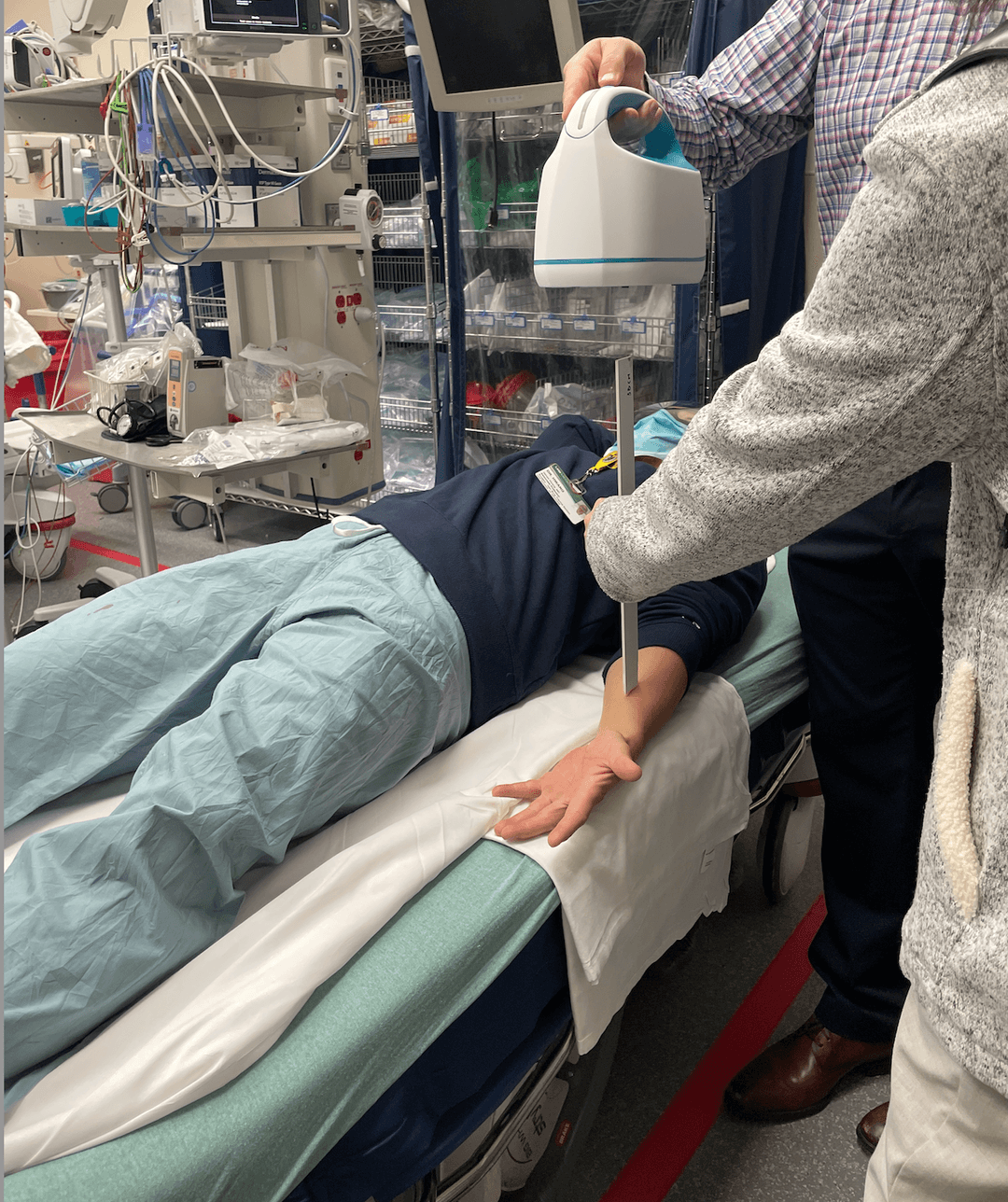
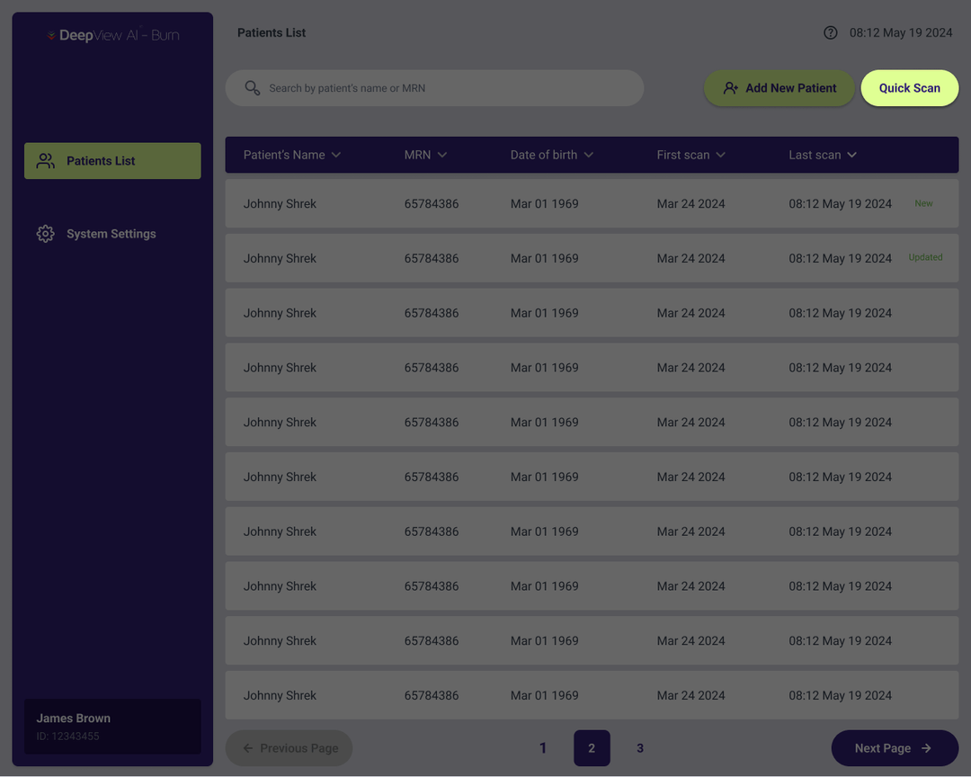
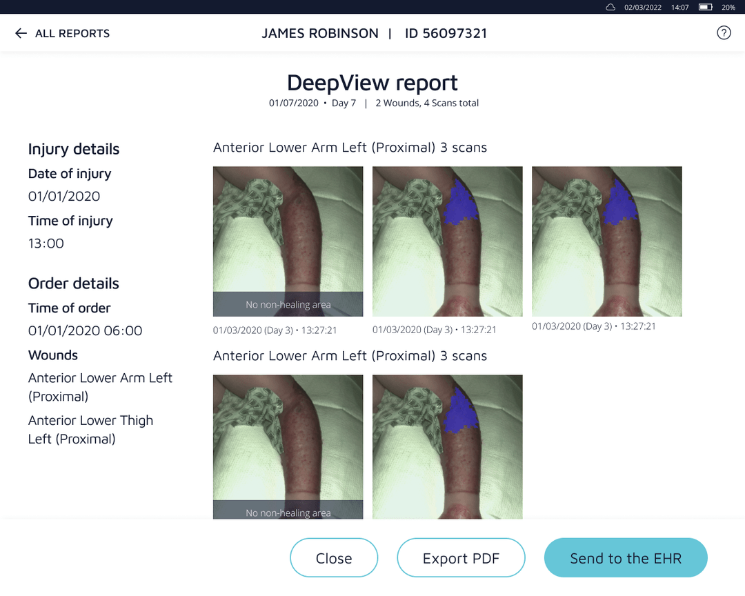
Quick Scan mode + EHR integration cut time-to-scan from 7+ steps to a single tap in emergencies.
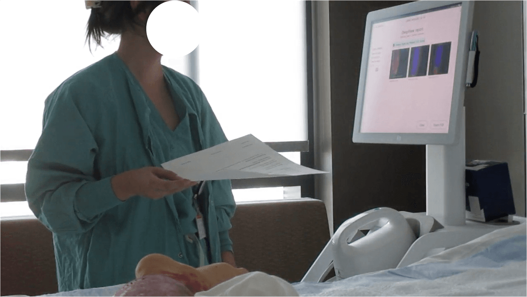
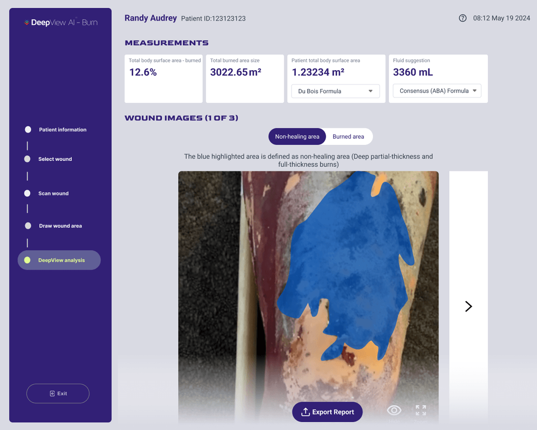
Explainable AI report with visual color maps, TBSA measurements, and contextual guidance.
Built Figma design system from the ground up, unifying language across all 4 product lines.
+
Hospitals in clinical studies across UK & US
Participants in formative usability study
Real users in summative validation — passed
Product lines unified in one design system
Core challenges
Three problems. One redesign.
Field research across 6+ hospitals revealed the same friction points
repeating across every clinical team we interviewed.
01
Workflow & Speed
Too many steps when every second counts
Complex clinical workflows resulted in long patient wait times.
The system was not adaptable for mass casualty events or
emergency rooms.
Design response
Quick Scan mode + EHR auto-pull eliminates registration steps
in emergencies, enabling scan-and-go in under 60 seconds.
02
AI Trust & Clarity
Black-box AI that clinicians couldn't trust
AI-generated outputs were complex and difficult to interpret.
Without understanding the results, physicians were hesitant
to act on predictions.
Design response
Enhanced AI report with visual overlays, TBSA data, fluid
resuscitation guidance, and plain-language explanations.
03
Brand & Consistency
Four products, zero visual consistency
No unified design system caused visual inconsistencies across
product lines, impacting brand cohesion and slowing
design-to-development handoff.
Design response
Built a complete Figma design system — tokens, typography,
components — deployed across all 4 product lines.
Research
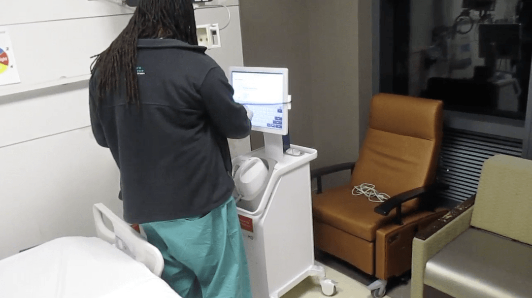
We went to the hospitals. Not just the users.
Understanding complex clinical workflows across diverse hospital systems
is no easy task. We visited 6+ hospitals nationwide, shadowing staff
for full-day observations and conducting interviews with physicians,
nurses, and IT teams. We also attended major conferences — AAEM, ABA,
SRBC, EMS — to understand the broader market landscape.
+
Hospitals visited
Conferences attended
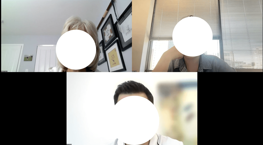
Usability participants
Physicians tried to use our device — University Medical Center, New Orleans LAUsability testing — UAB, Birmingham ALComplex EHR systems — Baylor Scott & White, Dallas TXUsability testing — UNC, Chapel Hill NCOnline interviews — Zoom, virtual
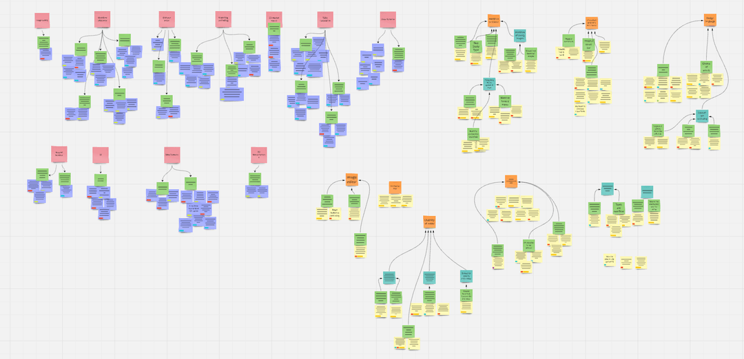
Key insights from affinity mapping
Workflow
"Time is precious in hospitals. Repeated data entry is the most frustrating part of this whole process."
AI Trust
"I don't understand what the AI is telling me — so I can't trust it, even if it's right."
Emergency
"In mass casualty events, I need to grab the device and scan immediately. Registration can wait."
Affinity map synthesizing insights from 6+ hospitals, internal engineering interviews, and user operation data
Define
Two very different users. The same urgency.
The product serves both government-funded mass casualty triage and
commercial burn centers — requiring one interface that scales from
battlefield ER to routine hospital rounds.
Government
BARDA & Department of Defense
In mass casualty events every second matters — medical resources are stretched thin.
Rapid burn assessment prioritizes critical cases, ensuring faster care and optimized resource allocation.
Sponsor: Biomedical Advanced Research and Development Authority (BARDA) & DoD.
Commercial
Hospitals & Emergency Rooms
70% of burn injury severity is overestimated by physicians (accuracy 64–76%), leading to unnecessary treatments.
Precise AI assessment reduces unnecessary interventions, wait times, and costs.
Impact: streamlined decisions, reduced medical expenses, improved patient outcomes.
Design
From research insight to shipped feature
Every major change traces directly to a specific insight from field
research. Here are the three decisions that defined the redesign.
01 — Emergency Access
"In mass casualty situations, I need to grab the device and scan immediately. Registration can wait."
Quick Scan — from 7 steps to 1 tap
We mapped the entire burn management workflow and identified that
data entry was the biggest blocker during emergencies. The
solution: a "Quick Scan" button that bypasses registration
entirely, letting clinicians capture wound images first and fill
in patient details after — a scan-and-go model.
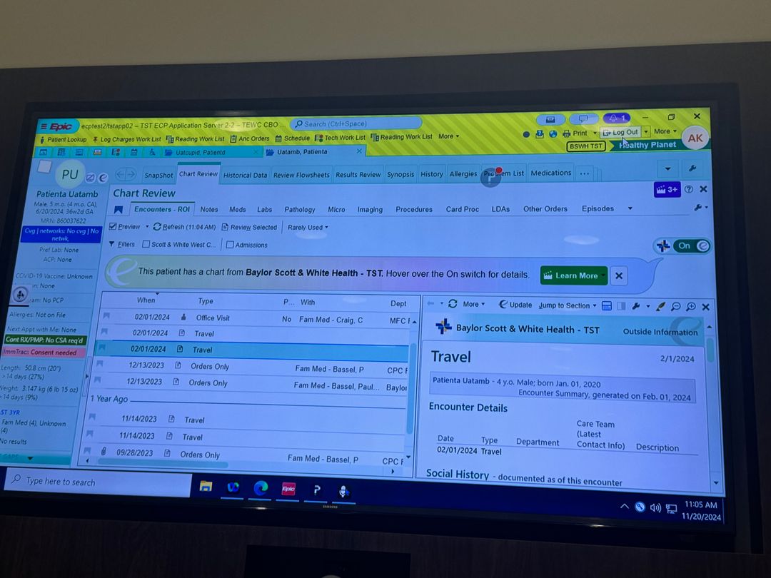
We also integrated EHR auto-pull: the system matches patient
profiles and merges data automatically, eliminating duplicate
entry for non-emergency cases.
Reduced time-to-scan in emergency scenarios
Before
7-step registration before every scan
After
Quick Scan + EHR auto-pull
02 — AI Trust
"Understanding AI-generated outputs was a challenge — users found the information complex and difficult to interpret."
From black box to trusted co-pilot
Physicians need to understand why the AI reached a
prediction before they'll act on it. We redesigned the DeepView
report to include visual color-coded overlays distinguishing
non-healing from burned areas, TBSA percentages, fluid
resuscitation suggestions, and plain-language explanations
alongside each AI output.
We also added real-time scan instructions for new staff,
addressing high staff turnover in clinical environments where
training time is minimal.
Reduced cognitive load; improved clinician confidence in AI results
"The absence of a unified design system led to inconsistencies in visual elements, impacting brand cohesion."
One design language for four products
Working across 4 product lines without shared foundations meant
every new screen required re-inventing decisions already made
elsewhere. I built a complete Figma design system from the ground
up — color tokens, typography scale, spacing system, iconography,
and a reusable component library.
This became the single source of truth for all 4 product lines,
enabling faster, more consistent design-to-dev handoff and
embedding WCAG 2.1 accessibility standards at the component level.
Consistent UI across all 4 product lines; faster dev handoff
Figma design system — shared across all 4 product lines
"The device helps us focus on critical cases faster while simplifying communication with families — a game changer in high-pressure environments."
— Nurse feedback, formative usability study
Validate
Tested in the field. Validated for FDA submission.
Every design decision was tested with real clinicians — first
iteratively in formative sessions, then formally in a summative
study that fed directly into our FDA De Novo submission.
Formative Study
Participants — 5 online, 7 in-person
An interactive Figma prototype let users explore software in realistic
scenarios. Sessions uncovered three major improvement areas:
EHR data challenges, real-time instruction needs, and AI
interpretation gaps.
Iterative improvements applied
Summative Validation
Real users in a hospital setting
Carried out with 15 real users to demonstrate ease of use.
The report was reviewed by a 60601 lab and FDA in our De Novo
submission. As the designer I was not involved in testing per
protocol — my co-workers ran it. In one word: we passed.
FDA De Novo submission — passed
What the design work enabled
Government contract: Initial BARDA contract fulfilled; research
and development extended until 2028. SaMD on track for FDA De Novo submission.
Clinical reach: 30+ hospitals across the UK and US participated
in clinical studies. Improved UI enabled clearer communication with patients
and families.
Accessibility: Color map redesign ensures clinical data is readable
for older adults and color-blind users — WCAG 2.1 compliant at the component level.
Design velocity: Unified Figma system across 4 product lines
eliminated repeated component work and cut design-to-dev friction across teams.
Prototype
See it in action
Part of the prototype is presented here for demo purposes. Due to
the complexity and confidentiality of this project, only selected
flows are shown.
DeepView AI® — Interactive Prototype
Prototype coming soon
Only select flows are shared due to project confidentiality